Branding La Conac. A sparkle of Dolce Vita style in Hospitality
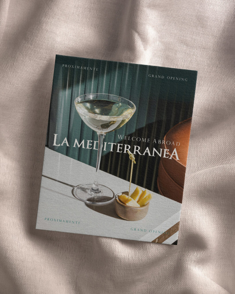
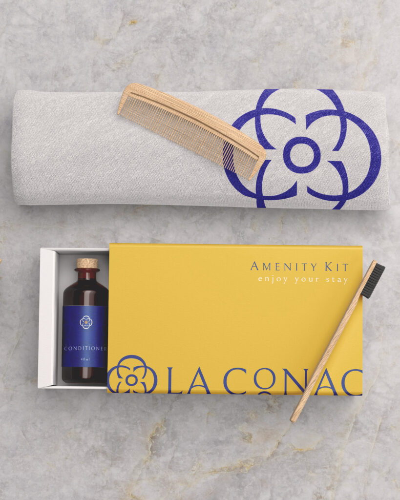
Brand Identity · Digital Design La Conac In 2024, under new management, La Conac reopened with a refreshed and revitalized image. This small hotel in the city of Arad offers guests a peaceful, elegant, and comfortable retreat. The new visual identity was designed to convey a sophisticated resting experience, evoking the pleasure of travel, relaxation, and the ability to enjoy life (even during business trips). Client: La Conac · Arad by Ari Apartments Industry: Hospitality Services: Brand Design, Social Media Design, Printed Design Credits: Photography – ILIHAUS Ilisie Sergiu Adrian Brand Designer & Author: María Belén Kippes Brand Identity · Digital Design La Conac In 2024, under new management, La Conac reopened with a refreshed and revitalized image. This small hotel in the city of Arad offers guests a peaceful, elegant, and comfortable retreat. The new visual identity was designed to convey a sophisticated resting experience, evoking the pleasure of travel, relaxation, and the ability to enjoy life (even during business trips). Client: La Conac · Arad by Ari Apartments Industry: Hospitality Services: Brand Design, Social Media Design, Printed Design Credits: Photography – ILIHAUS Ilisie Sergiu Adrian Brand Designer & Author: María Belén Kippes https://arriverdesign.com/wp-content/uploads/2025/02/laconac-colors-2.mp4 The “Mediterranean Vibes” and the “Dolce Vita” (a lifestyle of relaxation, art, and beauty) have strongly inspired the brand’s personality and visual style. Seeking warmth and harmony, the new brand identity for La Conac combines a vibrant and welcoming color palette: deep blue, sunny yellow, with accents of orange, light turquoise, and chalk white. The main typography in the logo and throughout the typographic system is Bellefair, a classic serif that reinforces the feeling of balance, elegance, and timelessness. Archetype Analysis To build a deeper brand-connection with guests and ensure every brand element is purposeful and emotionally engaging, I used the method of Archetype Analysis to define the brand’s personality. The Explorer archetype reflects the desire to travel, to discover new places and experiences. The Lover archetype embodies intimacy, relax and pleasure. By combining these two archetypes, we crafted a brand that goes beyond just accommodation, offering and communicating a refined and emotional experience. SOCIAL MEDIA PRESENCE The new brand identity was mainly applied in the digital space. This strategic redesign helped solidify the hotel’s identity, projecting a more polished and consistent image on Social Media, complemented with professional photography and videos. La Conac not only achieved a stronger and more consistent brand perception, but also positioned itself as an ideal destination for travelers, couples, and families looking for a unique, intimate, and serene stay in the city, whether for leisure or work. RELATED PORTFOLIO / Brand Identity Murmur Gem Artizanal, a new visual identity inspired by slowlife and nature Brand Identity Feminine & soft visual identity for Koraiken Boutique in Patagonia Brand Identity La Mediterránea: Refined gastronomy branding with spirit of adventure Brand Identity Load More Want to work with us? LET´S CONNECT NOW! Instagram Facebook WhatsApp E-mail BASED IN ROMANIA. WORKING WORLDWIDE
Branding La Conac. A sparkle of Dolce Vita style in Hospitality Read More »