This project was made for Alexandra, a young talented musician who began studying music in her childhood. She often says that “someone up there” shaped her destiny through music, guiding her to meet the right people at the right moments, allowing her to become a professional musician. Her lifelong companion in this journey is the harp.
Client: Alexandra Rebeca Iancu
Industry: Creativity – Music
Services: Brand Design, Printed Design
Brand Designer & Author: María Belén Kippes
Brand Identity · Brand Collateral
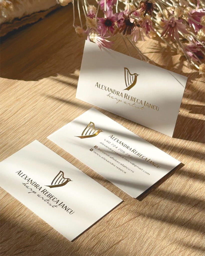
Harp Artist, Alexandra Rebeca Iancu
This project was made for Alexandra, a young, talented musician who began studying music in her childhood. She often says that “someone up there” shaped her destiny through music, guiding her to meet the right people at the right moments, allowing her to become a professional musician. Her lifelong companion in this journey is the harp.
Client: Alexandra Rebeca Iancu
Industry: Creativity – Music
Services: Brand Design, Printed Design
Brand Designer & Author: María Belén Kippes
Alexandra started her musical journey performing ambient music at events, primarily weddings, with a distinctly feminine, almost fairytale-like presence.
However, as her career evolved, she felt the need to elevate her image to reflect her professional growth. She wanted to establish herself as a professional harpist capable of performing in concert halls and musical events, appealing to a different kind of audience.
The challenge was to find a balance between preserving her delicate, fresh, and elegant identity—rooted in the mystical and enchanting nature of the harp—while also projecting a strong, professional image.
To achieve this, I crafted a visual identity that harmonizes femininity with professionalism.
I selected a color palette of gold, pink, and white to emphasize elegance and delicacy while maintaining a sense of sophistication.
The typography combines a clean and structured sanserif font to convey elegance and strength, with a graceful handwritten font reflecting creativity and personality.
The most distinctive element of the brand is the isotype, which blends the figure of a harp with a bird—a nod to both Alexandra’s central instrument and her voice. The singing bird symbolizes delicacy, charm, and a captivating presence, embodying the essence of Alexandra’s musical performances.
Besides the visual identity, I designed new business cards using a 3D gold foil technique on a soft matte white paper, leaving a refined and lasting impression when shared with potential clients, collaborators, or fellow musicians.
This new visual identity allows Alexandra to maintain her enchanting and feminine essence while confidently embracing her evolution as a professional harpist ready to reach new stages and audiences.