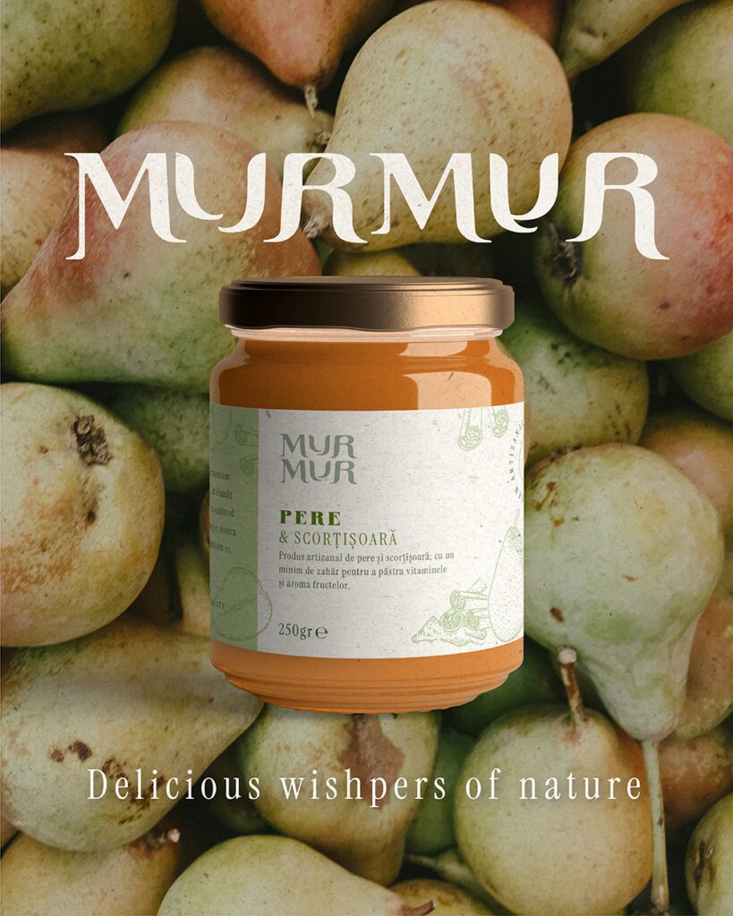
Murmur Gem Artizanal, a new visual identity inspired by slowlife and nature
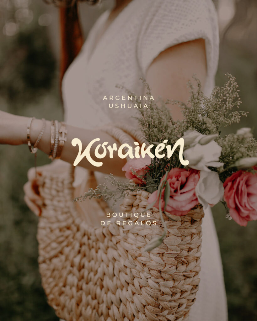
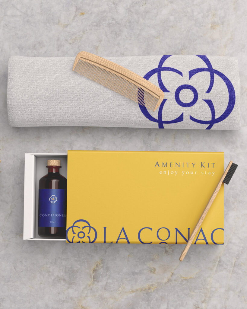
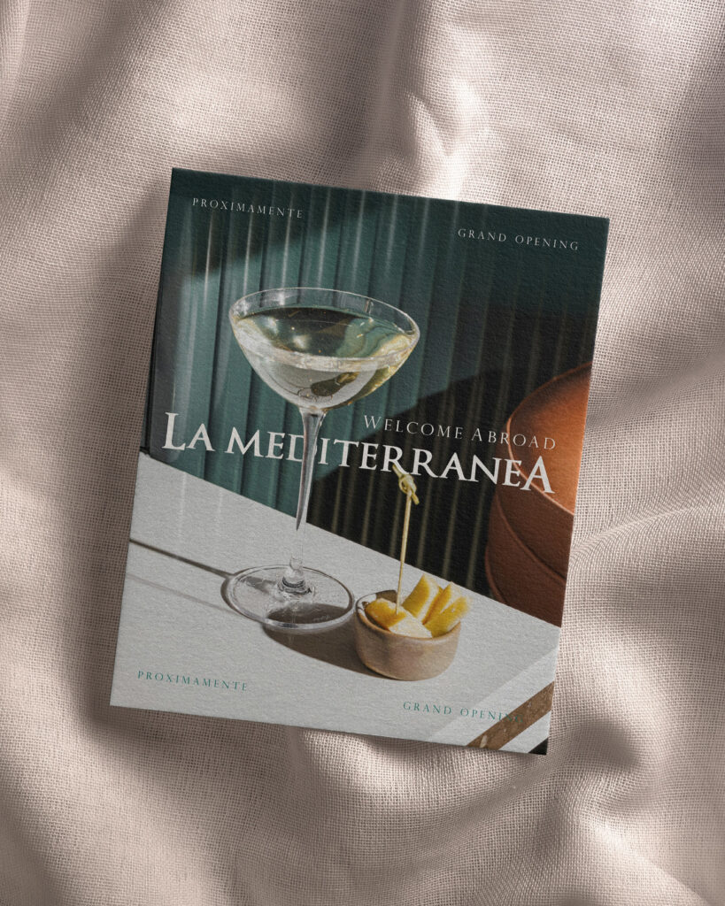
Brand Identity · Packaging Design Murmur Murmur (meaning ‘whisper’ in Romanian) is an artisanal jam brand whose goal was to create an identity that moves away from the usual ‘natural’ and ‘healthy’ stereotypes, both visually and in its brand narrative. Client: Murmur Gem Artizanal Industry: Food Brand – Gastronomy Services: Brand Design, Creative Direction, Packaging, Social Media Design, Printed Design Brand Designer & Author: Maria Belen Kippes Brand Identity · Packaging Design Murmur Murmur (meaning ‘whisper’ in Romanian) is an artisanal jam brand whose goal was to create an identity that moves away from the usual ‘natural’ and ‘healthy’ stereotypes, both visually and in its brand narrative. Client: Murmur Gem Artizanal Industry: Food Brand – Gastronomy Services: Brand Design, Creative Direction, Packaging, Social Media Design, Printed Design Brand Designer & Author: Maria Belen Kippes The brand was designed for young, urban people who seek a holistic way of wellbeing—mind and body— and who value the origin of the products they consume, choosing quality over quantity. The main pain point identified was the discomfort of living surrounded by noise and stress in modern city life, and the—conscious or unconscious—need for contact with nature, calm pauses, and real moments of enjoyment in everyday routines to feel balanced. From a conceptual and psychological approach, Murmur was imagined as someone who speaks softly but with depth. Someone who enjoys simple things: a slow breakfast, a sunlit open window, a warm cup, a good book, walking through the city without rushing. A person with a refined yet simple aesthetic sense—curious, independent—who values mindful self-care and deeply appreciates their time. Respecting the seasonality of each ingredient, Murmur’s recipe combines fruits with flowers or spices in unexpected ways—strawberry and lavender, pear and cinnamon, peach and jasmine—creating a delicate sensory experience. Like a small ritual of flavor and silence, connected to a slow lifestyle. Each jar carries the “whisper of nature”: its cycles, its fruits, and its wisdom, offering balance within the fast rhythm of modern life. The project included the full development of the brand: strategy, visual identity, creative direction, packaging, and printed and digital design. As a result, the visual identity translates the ideas of nature, slow living, and delicatessen into soft, organic forms; a warm, earthy color palette; serif typefaces that balance classic and modern styles; airy visual compositions; and hand-drawn illustrations. From the creative direction, clear guidelines were defined for the visual language, photographic style, illustrations, and textures, ensuring conceptual and emotional consistency across all brand touchpoints. RELATED PORTFOLIO / Brand Identity Feminine & soft visual identity for Koraiken Boutique in Patagonia Brand Identity Branding La Conac. A sparkle of Dolce Vita style in Hospitality Brand Identity La Mediterránea: Refined gastronomy branding with spirit of adventure Brand Identity Load More Want to work with us? LET´S CONNECT NOW! Instagram Facebook WhatsApp E-mail BASED IN ROMANIA. WORKING WORLDWIDE
Murmur Gem Artizanal, a new visual identity inspired by slowlife and nature Read More »